
Webfaction case study
Helping Webfaction attract a less technical audience
Webfaction case study

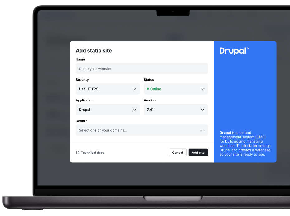
Webfaction is a managed hosting provider aimed at developers. I worked with them as a freelancer to redesign the product and make it more accessible to less technical users and capture a new segment of that market but also simplify the interface for existing users who were equally frustrated with how difficult to use it was.
The redesigned interface was well received by both the founders and users during testing. The founders later reported a reduction in support requests related to navigating the platform, and users consistently found common tasks easier to complete.
Webfaction was later acquired by GoDaddy.
After mapping out the jobs to be done users have on the platform, it became clear that Webfaction's interface contained a lot of unnecessary friction caused by confusing hierarchy, very technical terminology, and a dated design. Existing customers frequently contacted support to accomplish common tasks, while less technical users struggled to understand the terminology and navigation.
I analyzed support tickets, product analytics, and user journeys to identify common pain points. Users frequently struggled with website setup, FTP, and email account creation, while average session times of nine minutes suggested inefficient navigation. To understand why these issues occurred, I conducted moderated user research.
During the sessions, participants completed realistic hosting tasks while thinking aloud, allowing me to observe how they approached the platform, where they became confused, and the mental models they expected the interface to support. Here is the script I used.
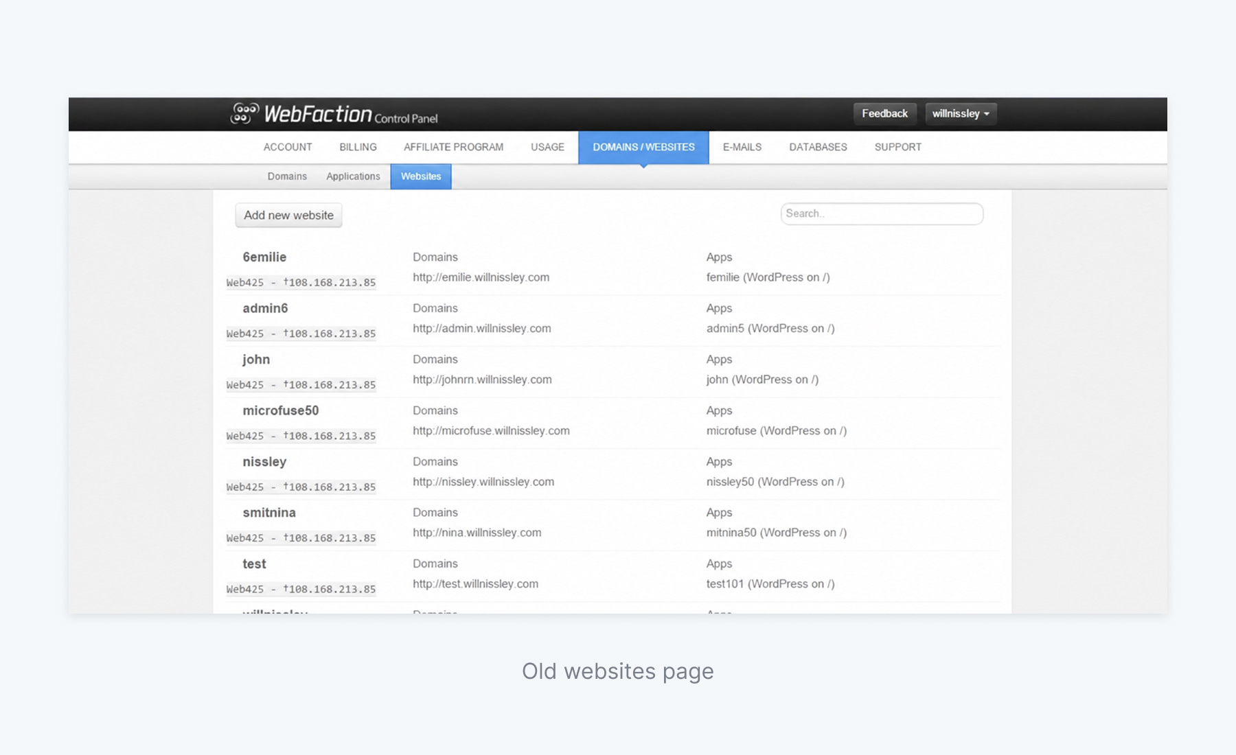
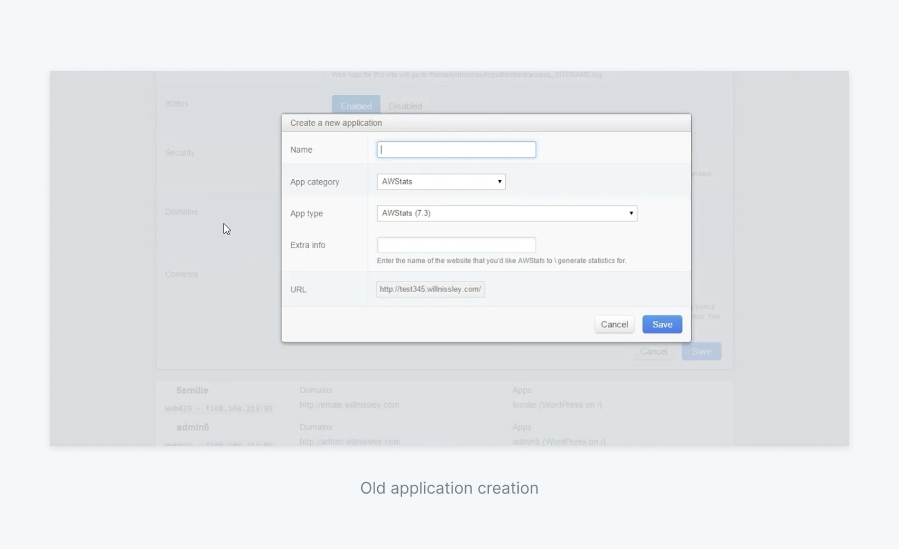
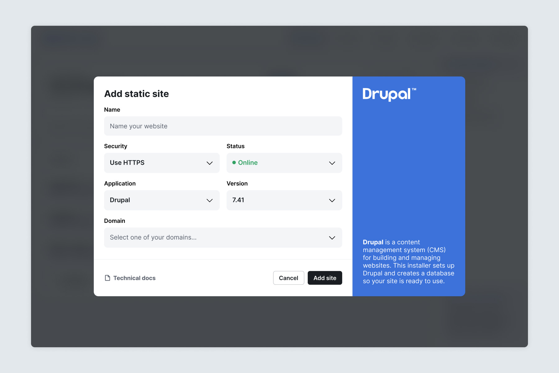
The process of creating a website involved users figuring out a sequence of steps by themselves. They first had to create an "Application", then add their "Domain", then create a “Website” where they select an Application and a Domain, then take it live. This was very confusing, especially for less technical users who just wanted to create a website.

I'm trying to create a website, but I don't get why I need to create an Application first.
I keep expecting a "Create website" button, but instead I'm jumping between different sections and hoping I'm doing this in the right order.
The less technical users understood what concepts like “SSL certificates” or a database mean when explained to them, but without any kind of guidance, they found the current interface confusing.
I'm worried I'll miss a step, I don't know where everything I need is.
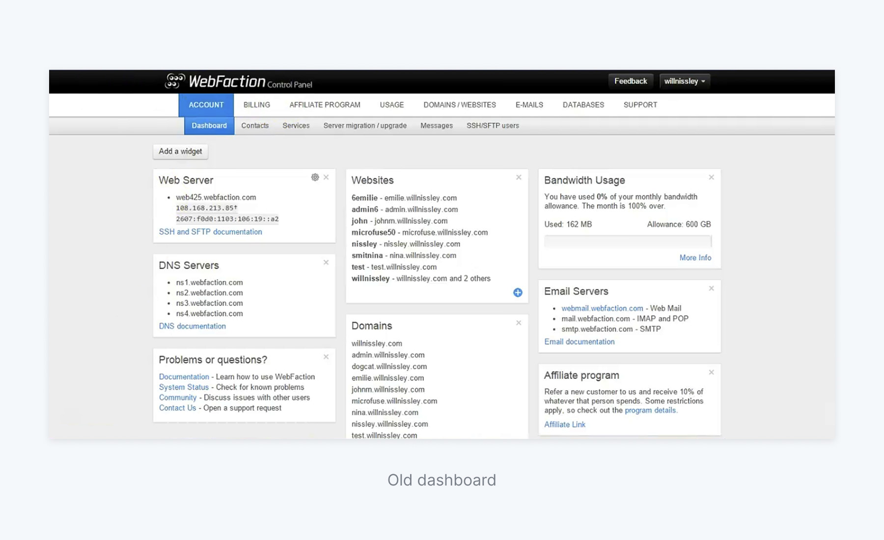
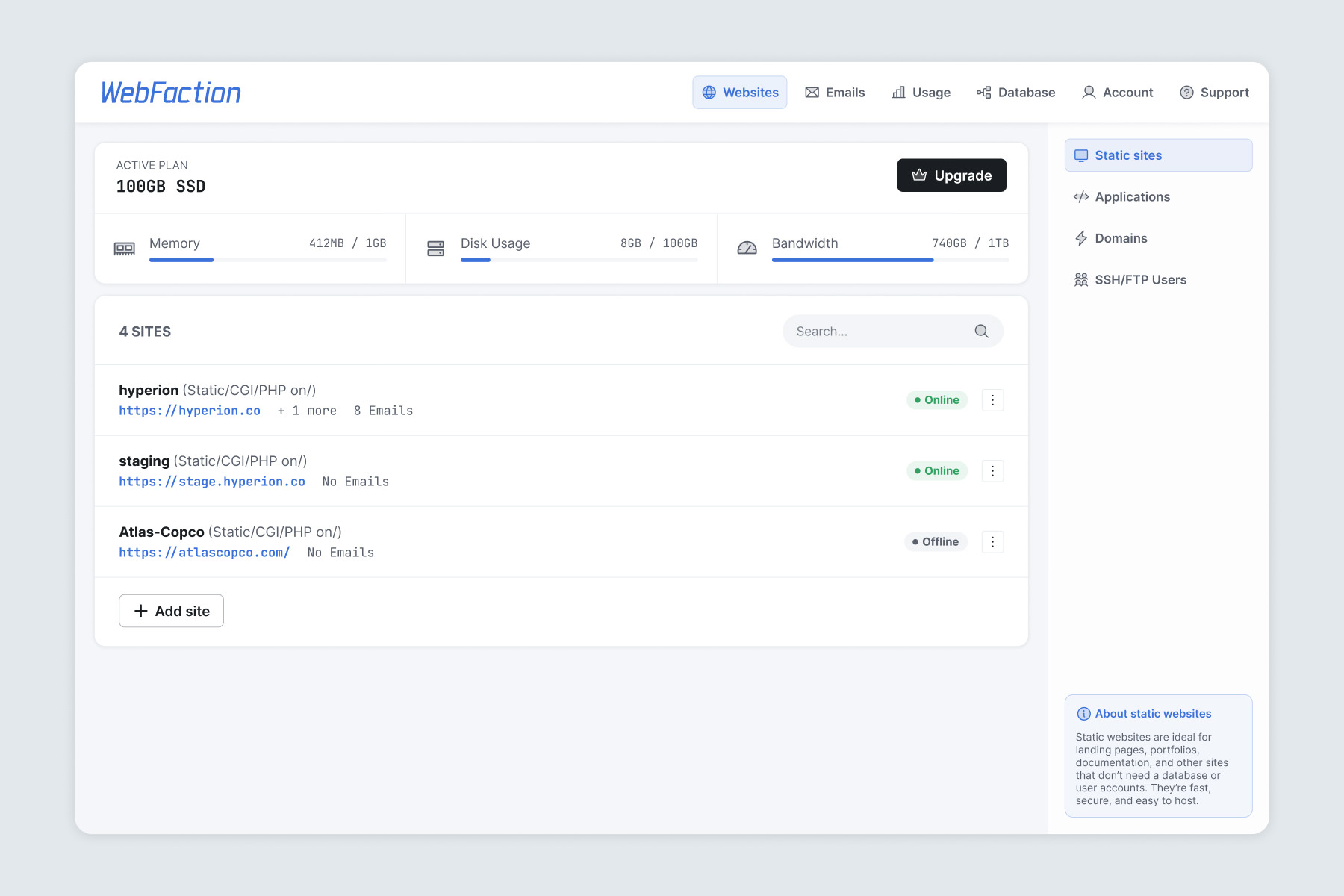
The dashboard was not aligned with the information users wanted most, such as which of my websites and apps are live, how much of my bandwidth and storage have I used, is my mailbox receiving emails, etc.
How do I know if my website is actually online? I don't see it anywhere.
This dashboard is not very useful right now.
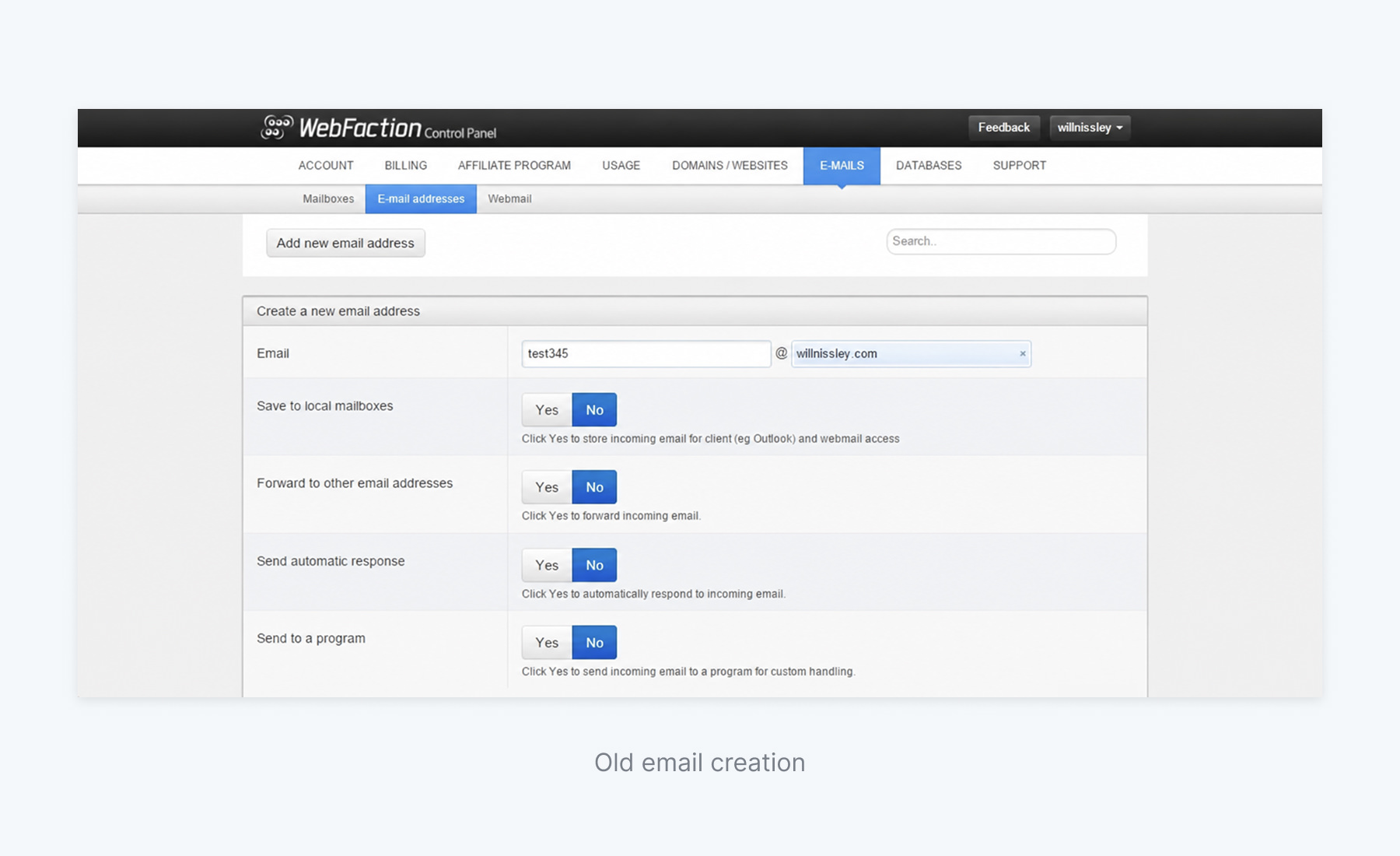
This is the old interface that users tested during user research.

| Opportunity | Impact | Effort | Priority |
|---|---|---|---|
| Simplify website creation flow | High | Medium | High |
| Reorganize navigation around user goals | High | Medium | High |
| Reduce technical language | High | Low | High |
| New dashboard | Medium | Low | Medium |
| Responsive design | Medium | Medium | Medium |
Once I had a good idea of what the biggest problems were for users, what sections they used most frequently and what they usually wanted to achieve with the interface, I started exploring ideas for how to improve it.
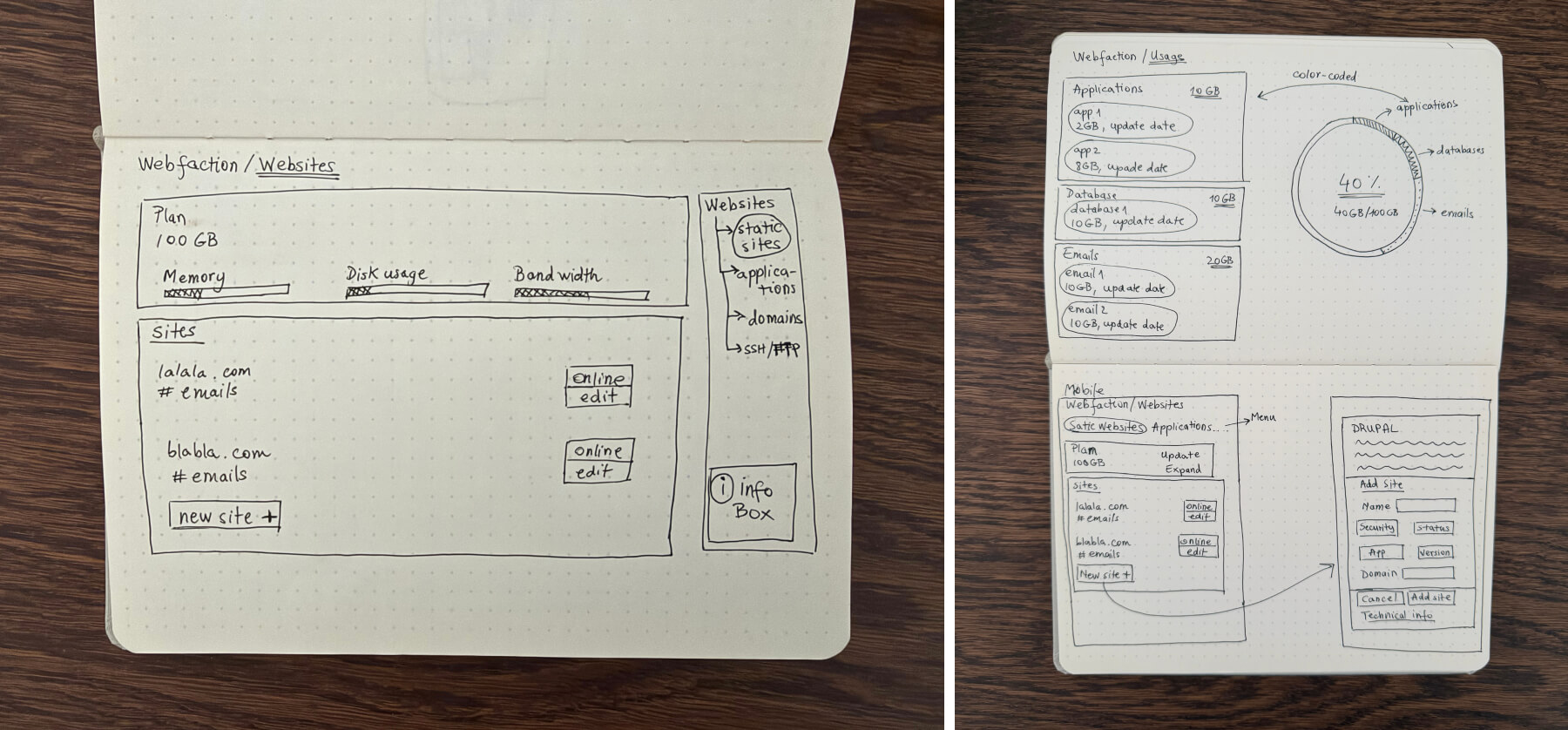
After I tried a few ideas on paper, I moved on to wireframes and continued to explore different ways to construct the interface at a higher fidelity.
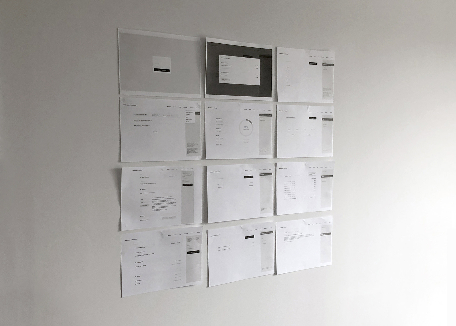
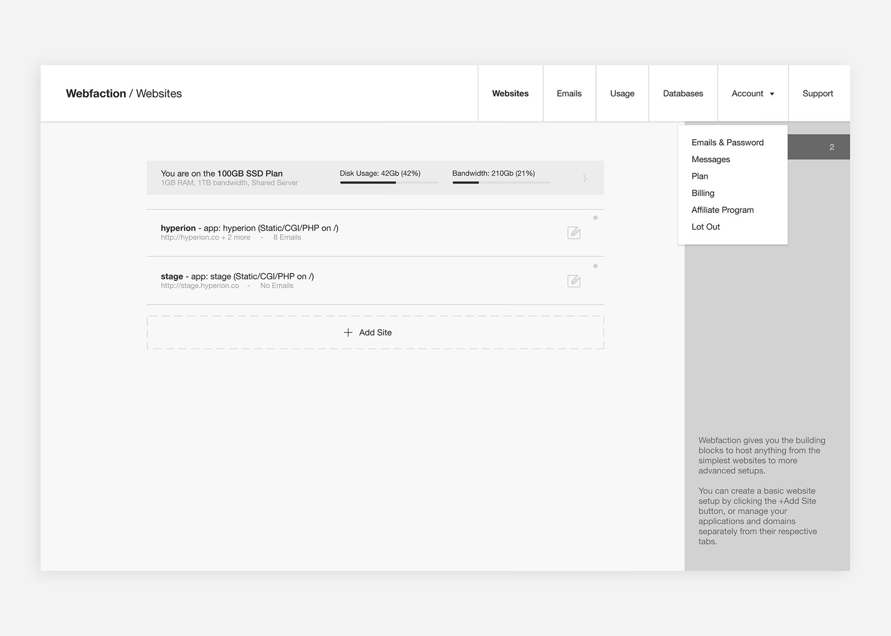
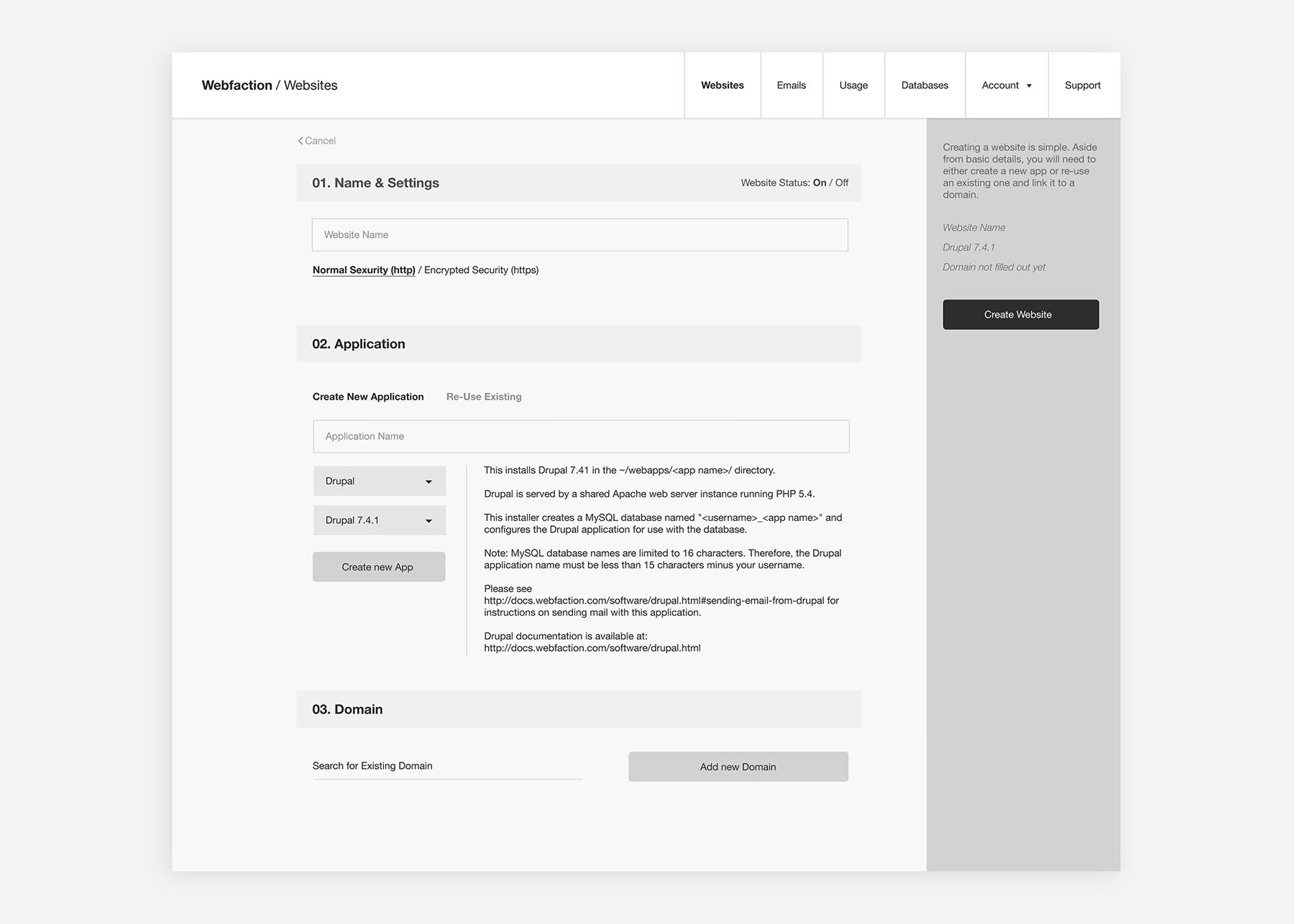
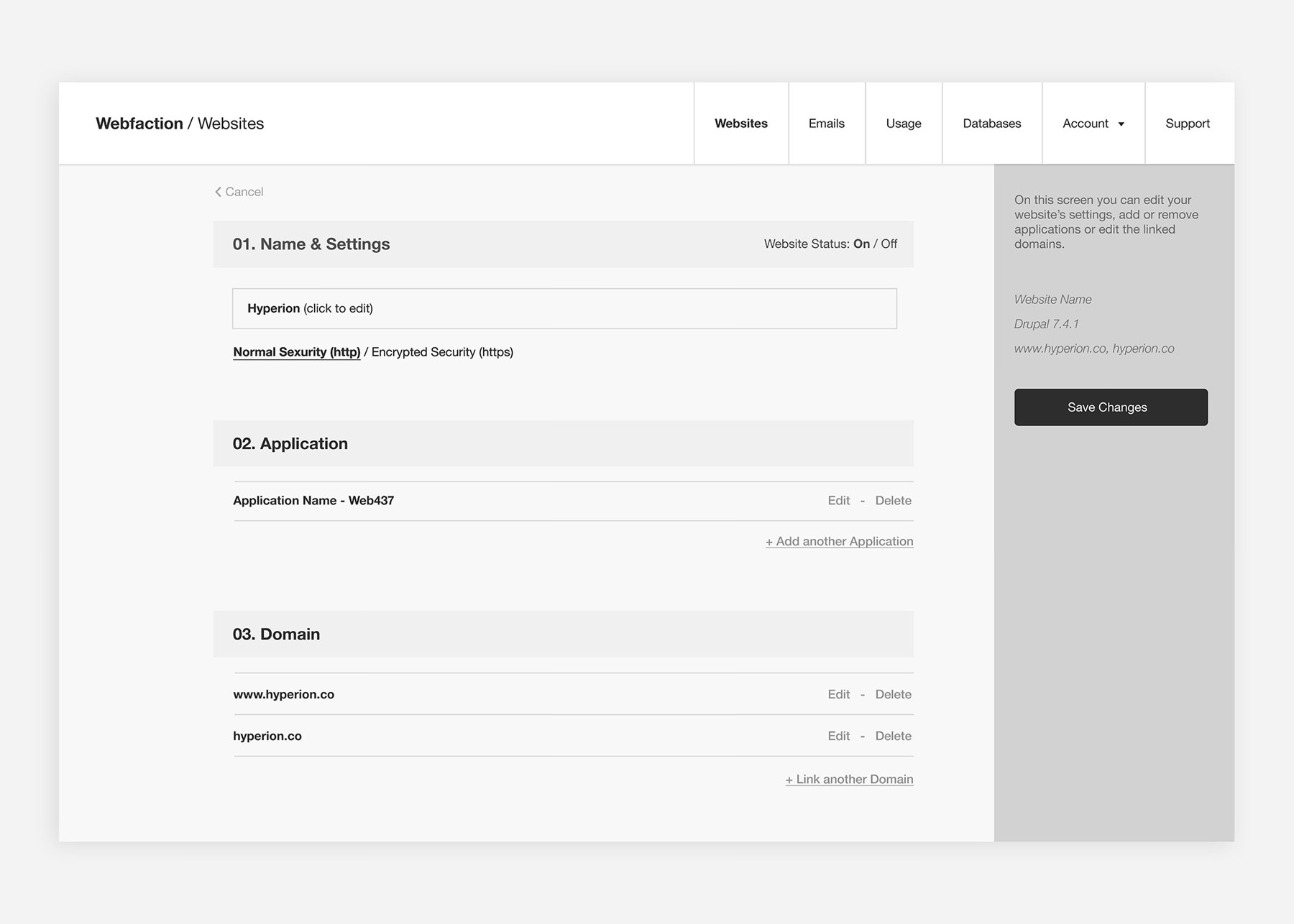
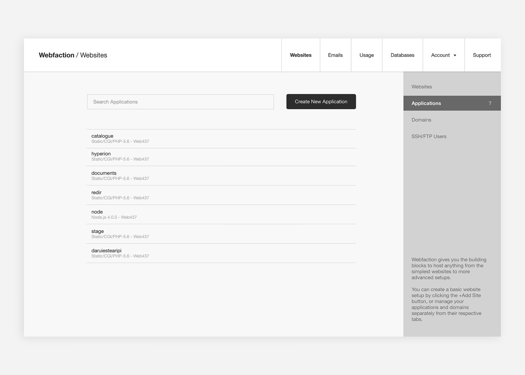
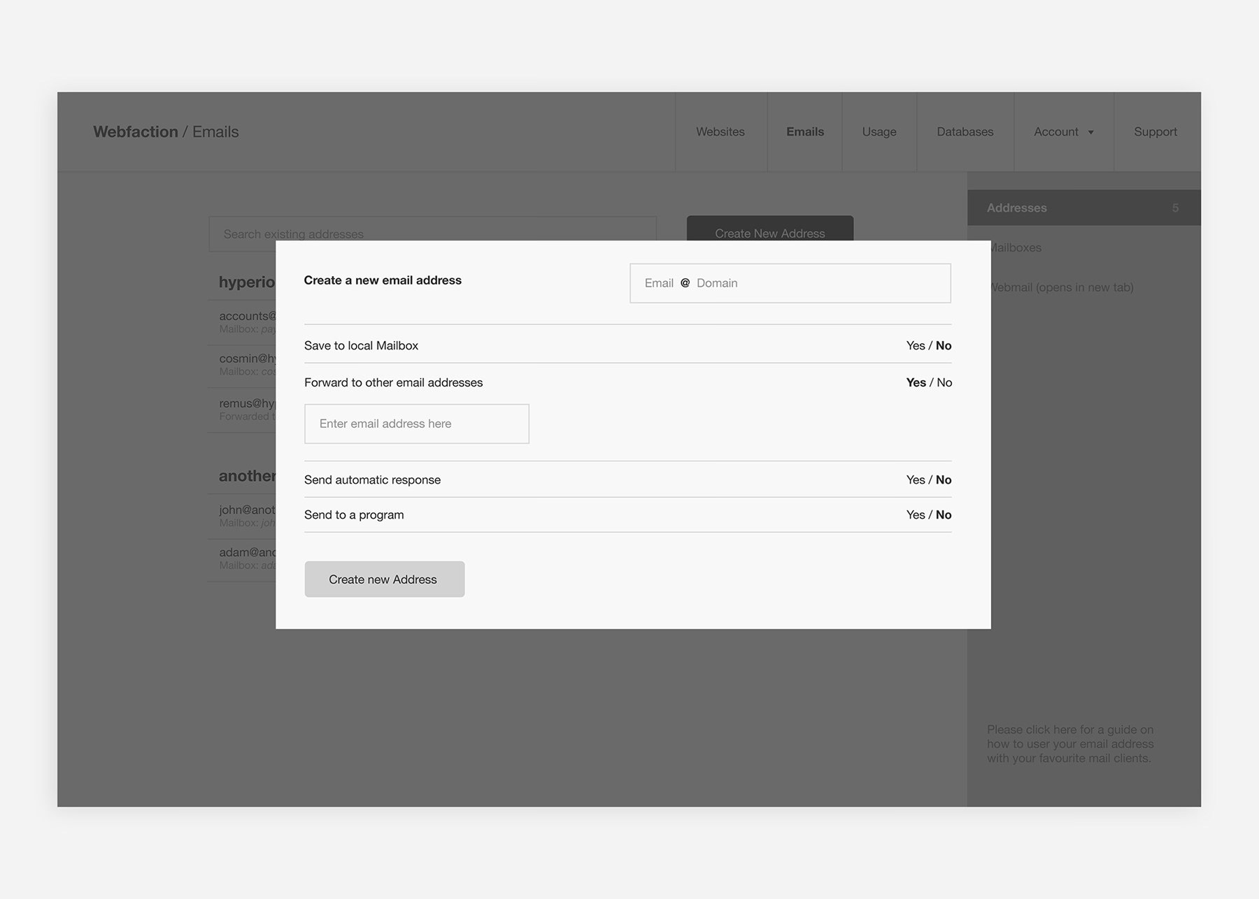
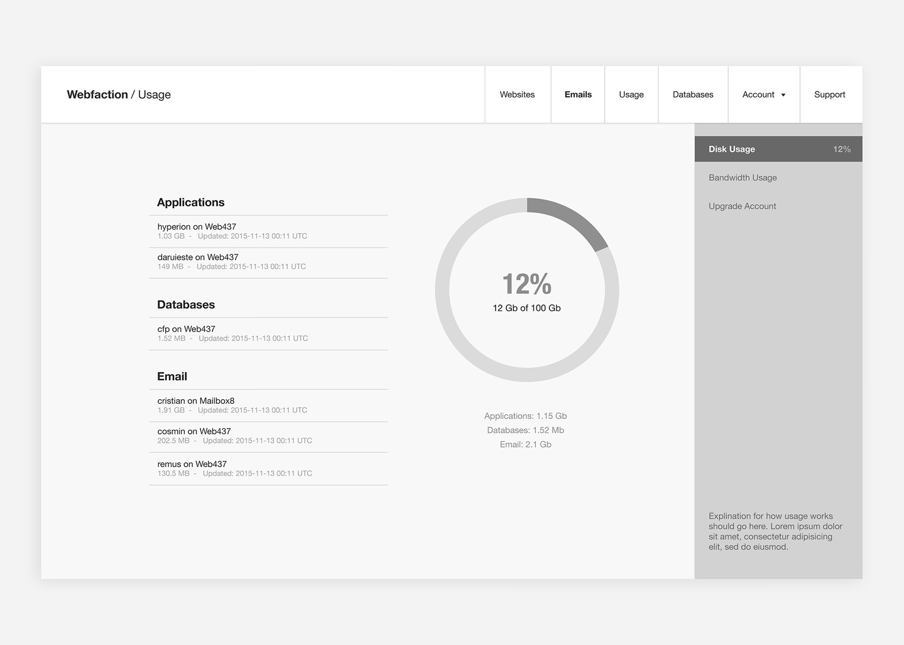
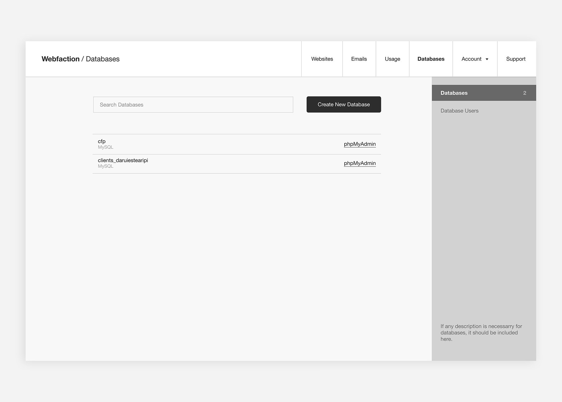
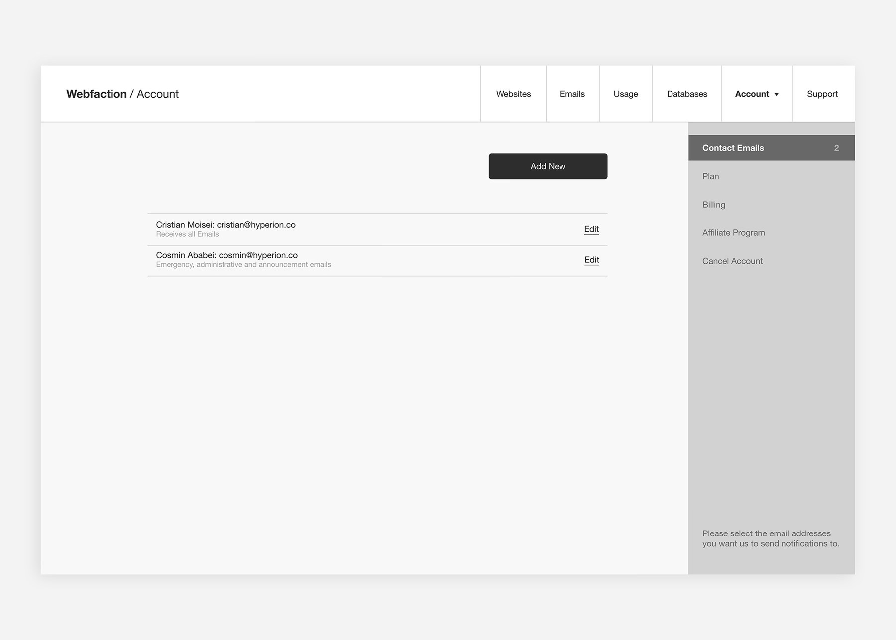
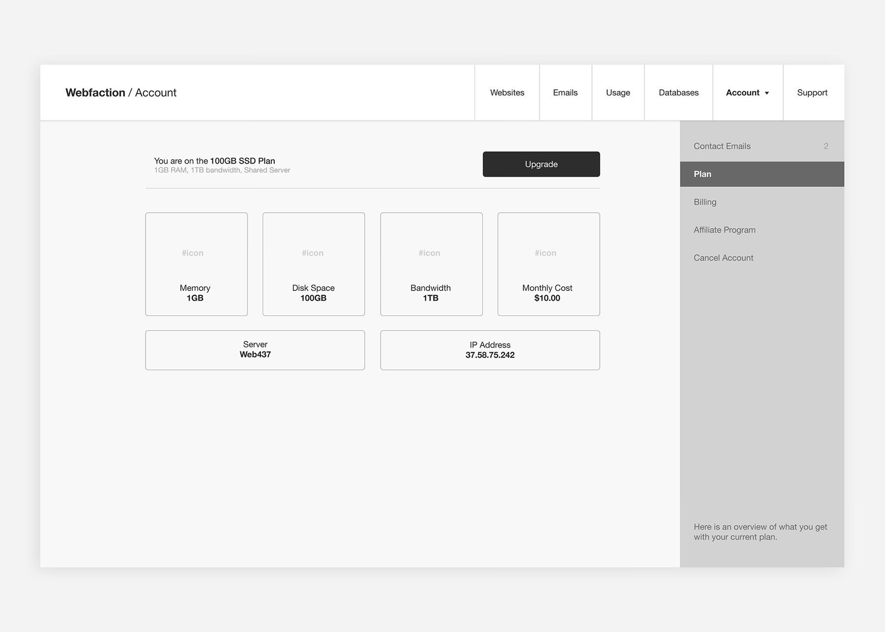
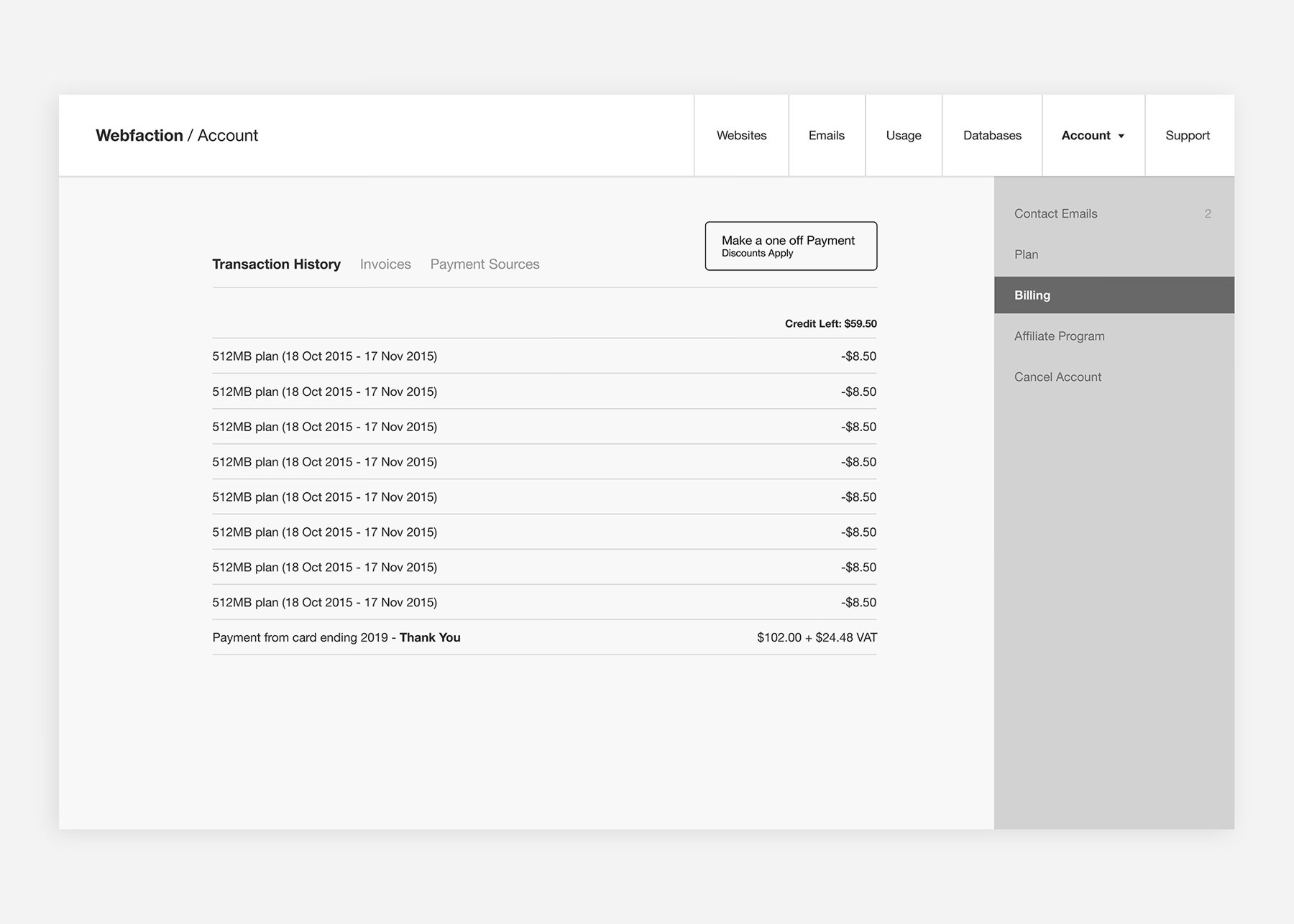
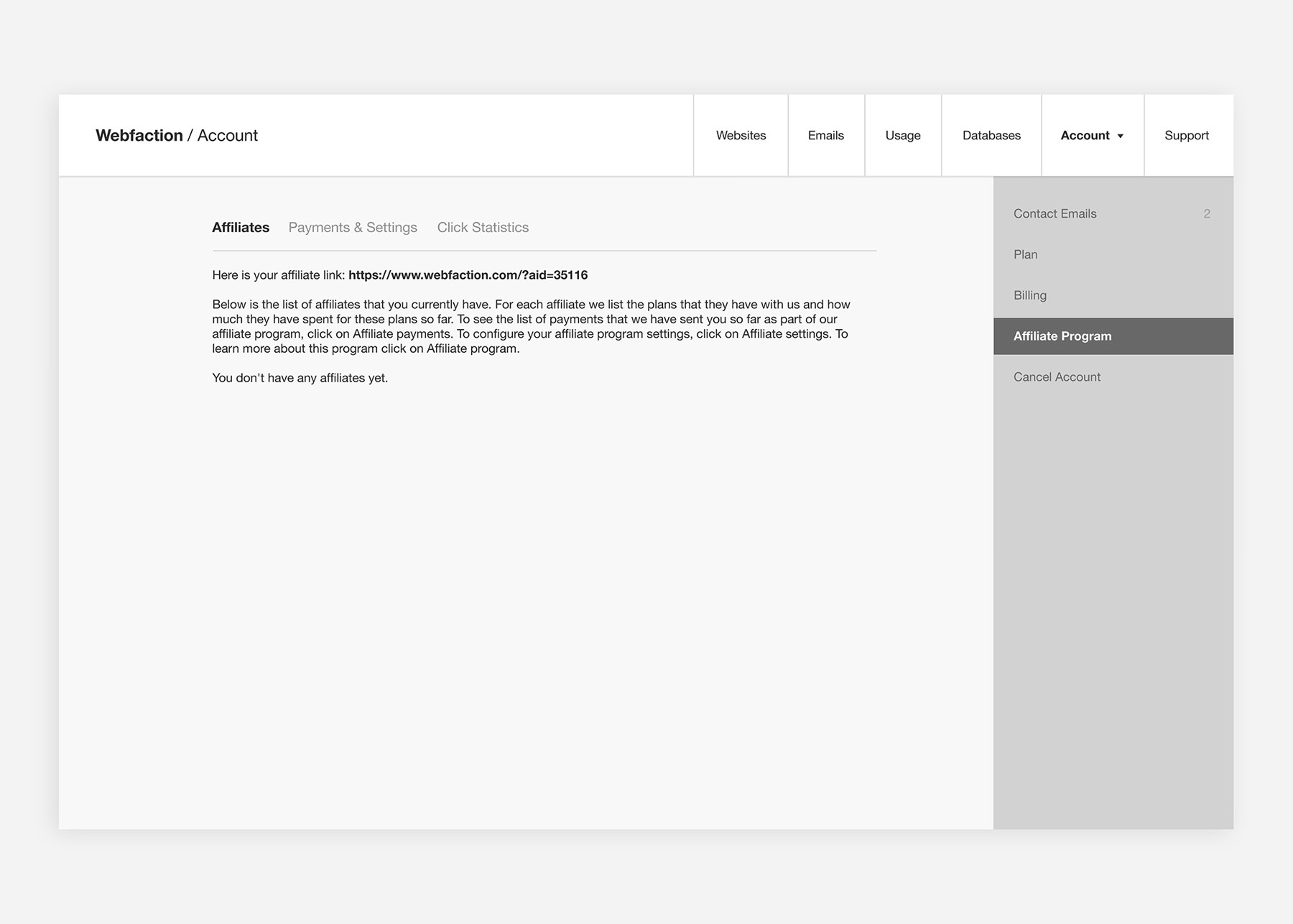
Before refining the visual design, I also focused on restructuring the platform's information architecture.
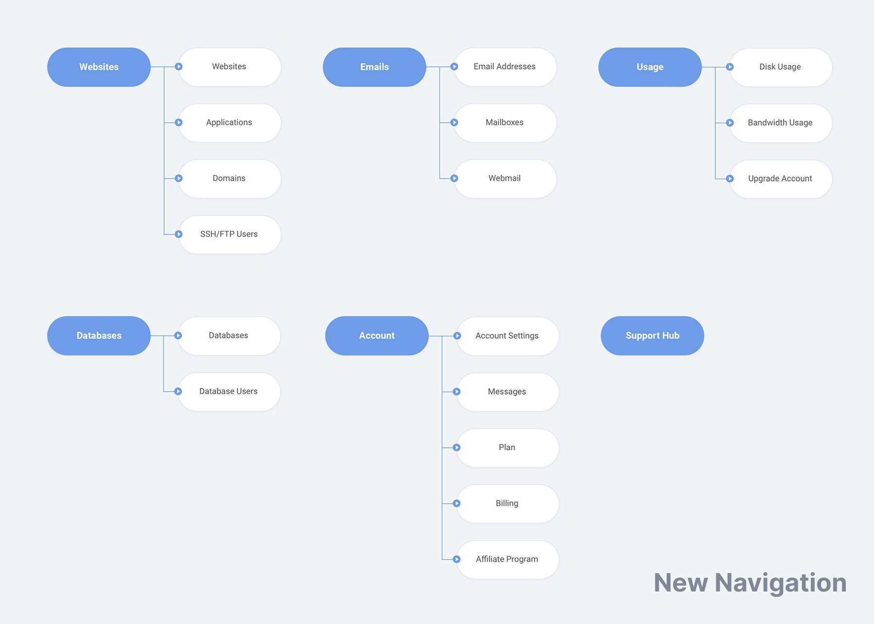
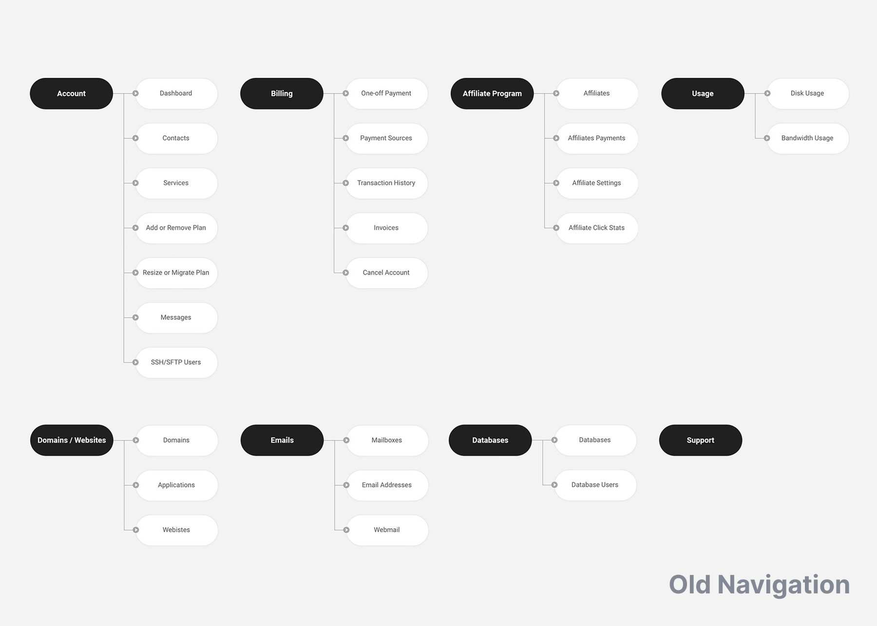
After I put together a first version of the new designs that all stakeholders were happy with, I conducted another round of moderated usability sessions with six participants using an interactive prototype. Participants completed the same key tasks from the discovery phase:
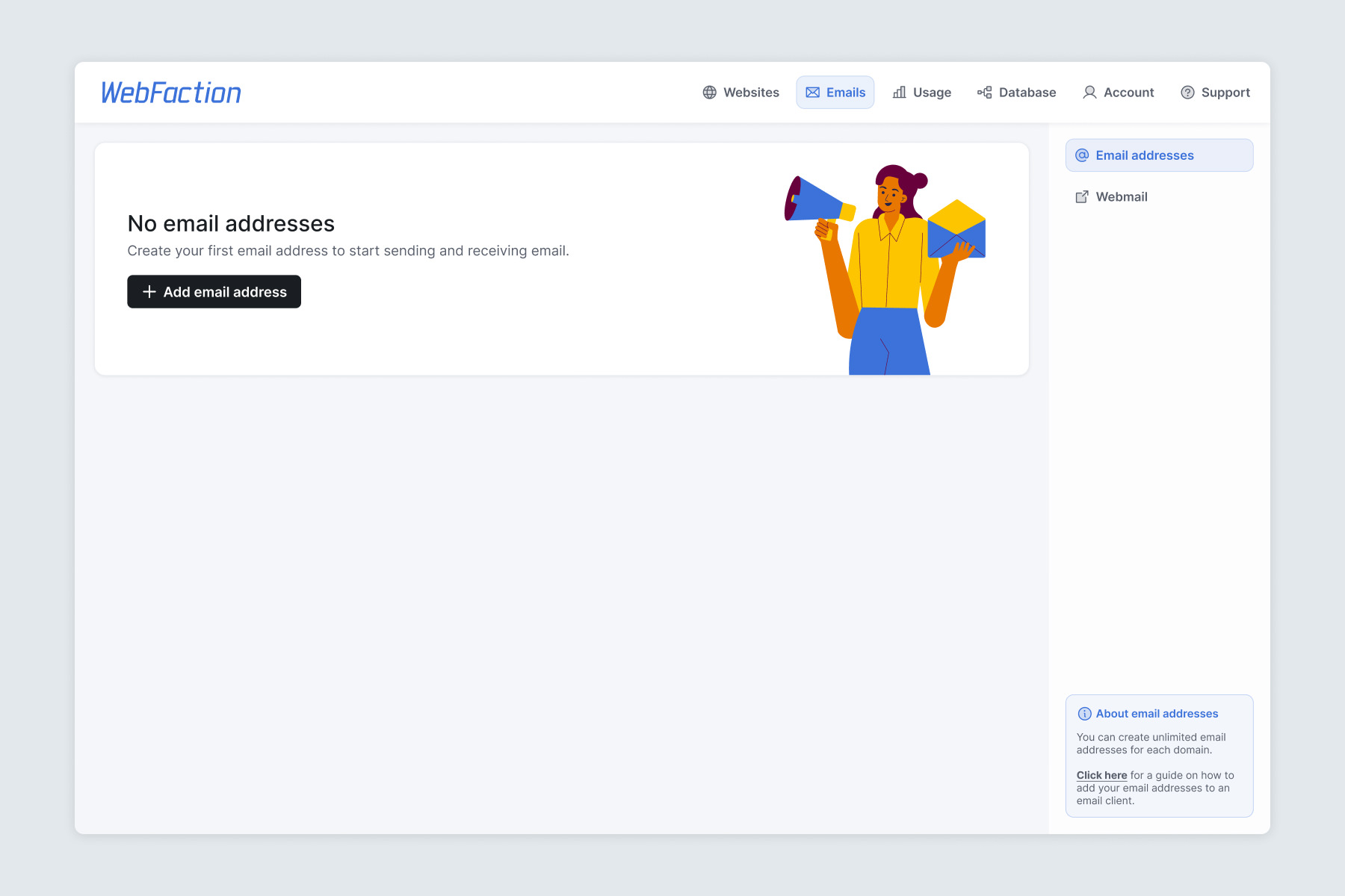
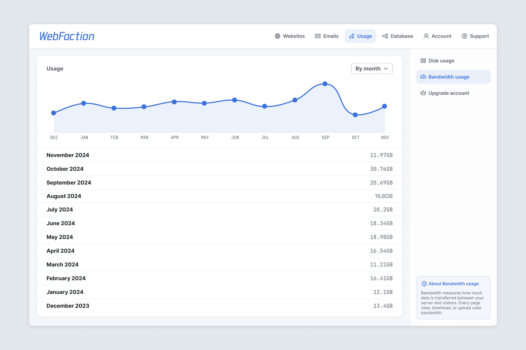
Compared to the original interface, participants completed these tasks with less hesitation and required little to no assistance. Navigation was consistently described as clear, and users appreciated having more important information immediately visible on the dashboard.
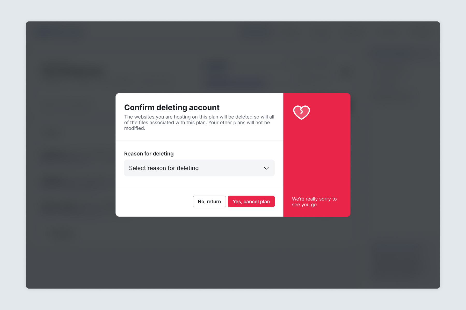
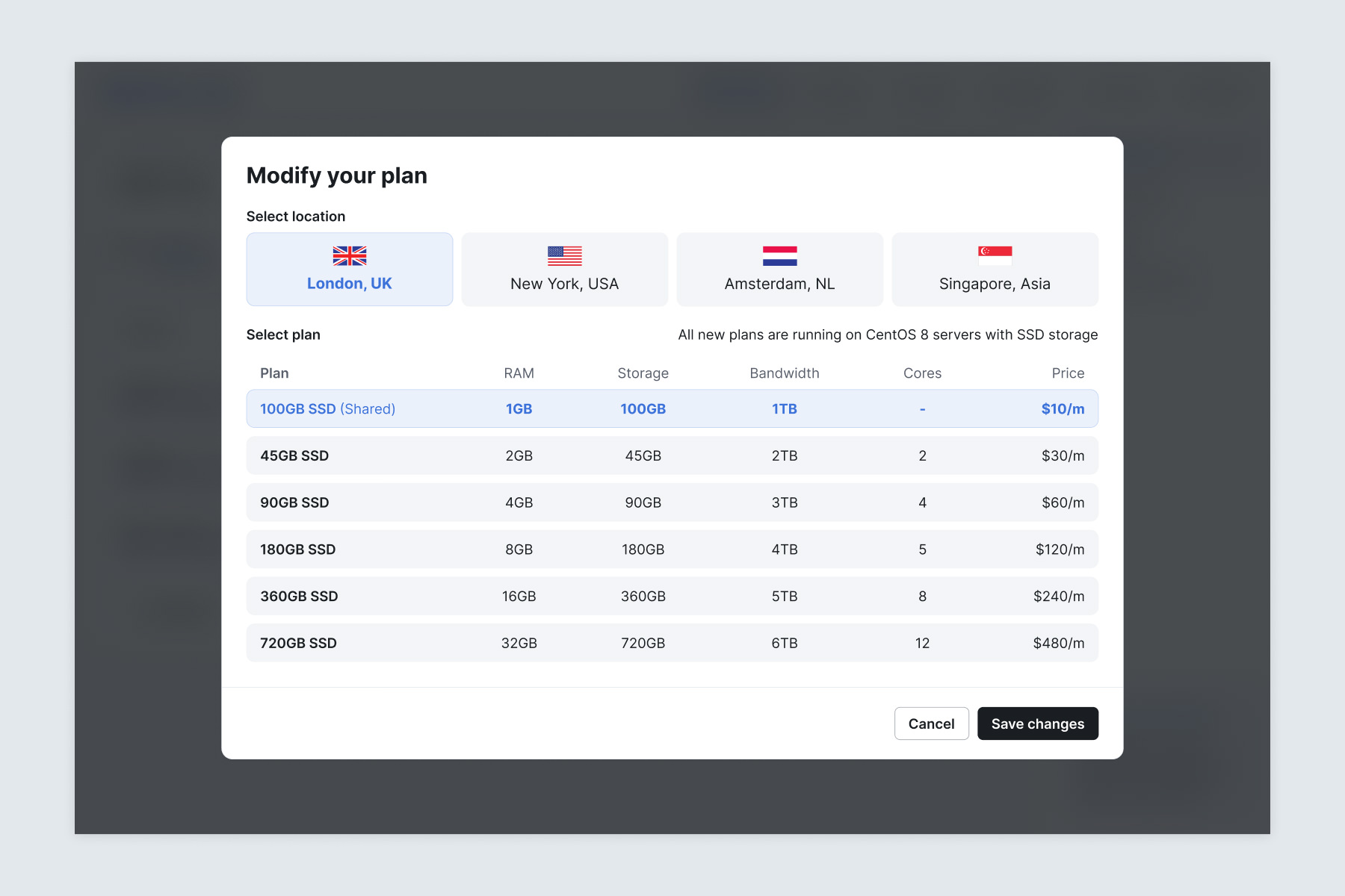
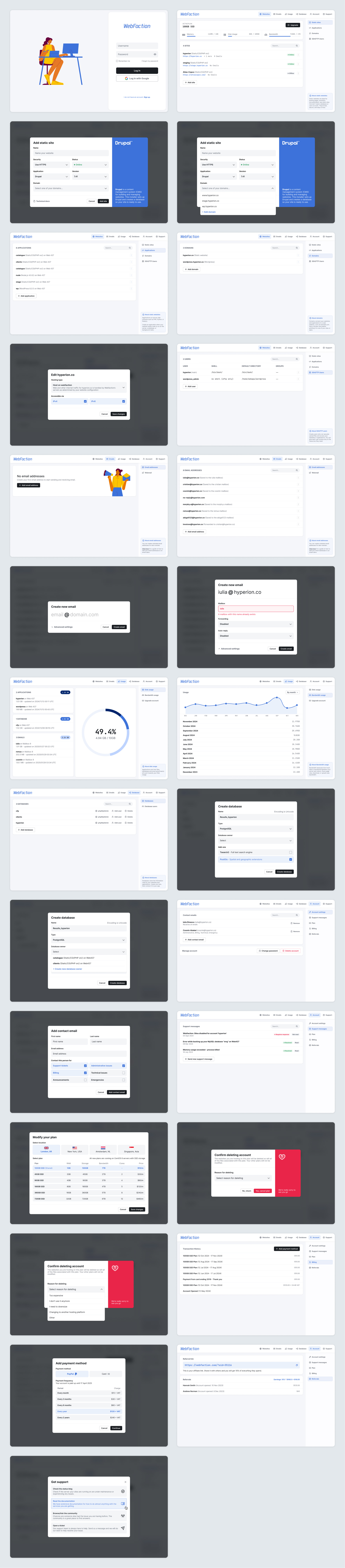
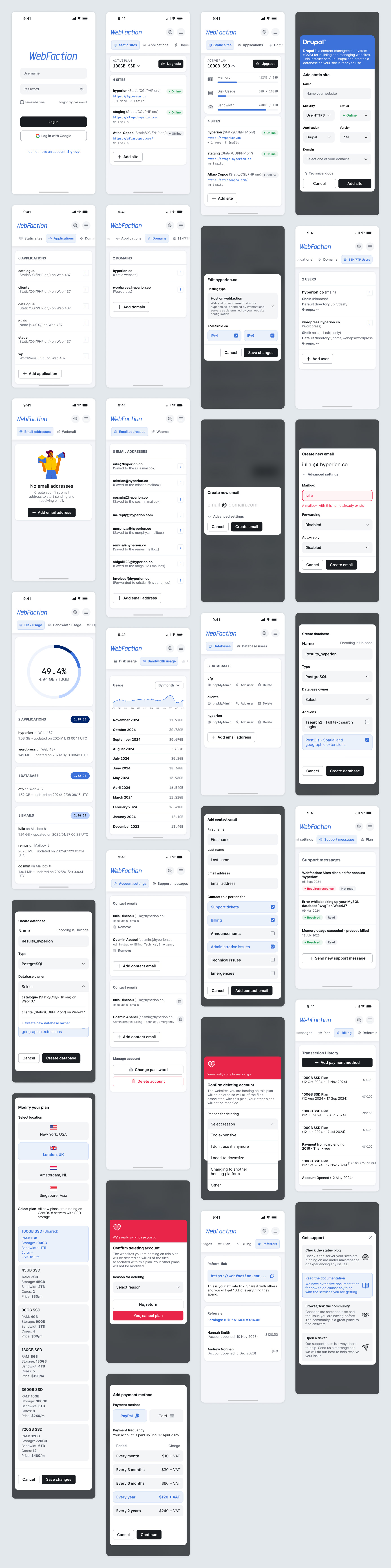
With a validated design, it was time to start coding, for which I collaborated with a front-end developer I worked with and back-end engineers from Webfaction.
Next case study
